Loyalty Discount Program
This is a Club Prophet Executive Report v4 – Power BI or PBI.
Note: Samples are using demo data and do not reflect real-world data.
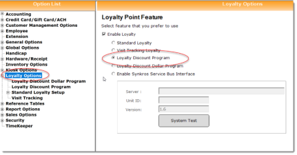
These reports are designed specifically for the Loyalty Discount Program. This is this selection in the Club Prophet Options screen for Loyalty Program:
Note: You can find instructions for this Discount Loyalty Program here: https://help.cps.golf/Content/pos-express/loyalty-program/loyalty-discount-program.htm
This guide will cover two different reports for the Loyalty Discount Program.
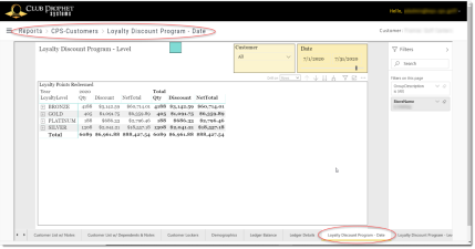
Loyalty Discount Program - Date
This report shows the Discounts and Net Total of items purchased by customers who are part of the Loyalty Discount Program.
Note there are several different Loyalty type programs and these reports are specific to the Discount Program only.
This is matrix type report where you get several options to drill both Rows and Columns. The different options will be discussed below.
Fields on the report include:
-
· Columns:
-
o Year – the Year (within the given date range) YYYY.
-
o MontyYear – the Month and Year (within the given date range) MMMYYYY.
-
o Date – the Date (within the given date range) MM/DD/YYYY.
-
-
· Rows:
-
o Loyalty Level – the Loyalty Level description (with associated discount as defined in CPS Loyalty setup) applied to the transaction.
-
o Full Name – Full Name of the customer who made the purchase.
-
o Group Description – The group description is the category that the discounted line item belongs to [Green Fee, Cart, Merchandise, F&B, Membership, Lessons, Range, Other]. Note: Filter on this field comes in handy if you just want to see Rounds (filter on Green Fee).
-
o Product – Product description where the discount was applied.
-
-
· Values:
-
o Qty – the number of items purchased where discounts where applied.
-
o Discount – the amount of Discount(s) applied to the given line item.
-
o Net Total – the Net Total for the given line item after the discounts where applied.
-
-
· Totals
-
o Row Totals will total the given row Values.
-
o Column Totals will total the given columns.
-
o Grand Total totals all values.
-
NAVIGATION
Matrix reports provide the ability to drill down on both Rows and Columns. There are three different ways to do this depending on how you prefer to see the data. To see the menu on the right below you need to either click on the report area or hover your mouse over it.
-
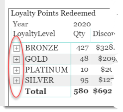
A plus sign [+] next to Rows where you can expand to the lower levels for just that row of data. Note: This is not available for columns.
-
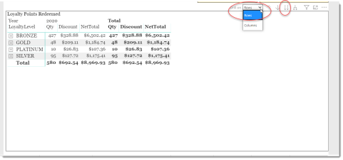
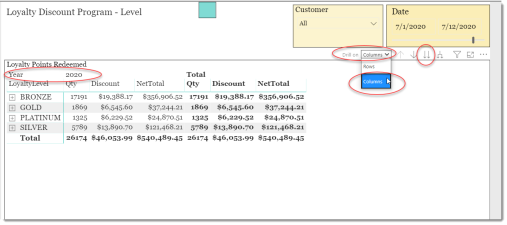
The Drill on drop-down allows you to select Rows or Columns.
-
The double-down arrow drills down one level for each click changing the view of the data to the next level.
-
The Pitch Fork looking tool will drill down to the next level, but it will keep the top level on the screen and indent the lower level.
Note: To navigate back up thru the levels, use the single Up-Arrow (not circled).
-
The single Down Arrow when turned on lets you use your mouse to select given data points to drill down on. Feel free to try it.
Stepping thru an example
Expand Rows using the + and - controls
You can scale down the data to just a couple days at one location to keep it simple:
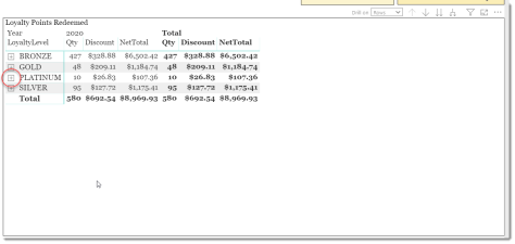
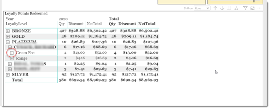
Clicking the plus sign [+] next to Platinum opens up that level as follows:
You can now see three customers with a total of 10 items under Platinum. If you want to see what the first customer purchased, click the plus sign [+] for that customer which is circled above:
This shows the Group Levels (Green Fee, Cart Fee, Merchandise, Range, etc). Clicking again will show the actual product name.
You can navigate back to the top of the report by using the minus [-] signs or the single up arrow in the upper right tool menu.
Drill Down on Rows using the Double-Down Arrow
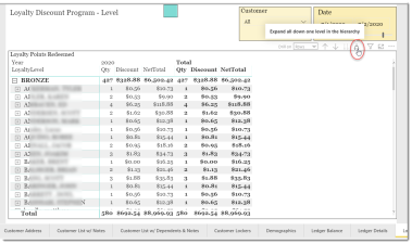
Similar to the plus [+] control drill-down, the Double-Arrow will drill down on all the rows instead of just one row. The Drill on drop-down defaults to Rows, and this dictates the navigation or Rows vs. Columns when using the other controls.
So, with rows selected, click the Double-Down arrows circled above, and this displays:
We now see the level has changed to the FullName. Clicking the Double-Down arrows again will change the view to Group Description, and again to Product Description. Again, use the Single Up arrow to navigate back to the top.
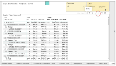
Notice in the above view that you lose the grouping feature. So, what if you want to keep the grouping to see this by Loyalty Level? Use the Pitch Fork looking control:
Now the report keeps the upper grouping Bronze in this case and shows each customer under the Bronze group. Bronze totals are included on that Bronze heading with Total (all groups) at the bottom of the screen. There is a scroll bar on the right to scroll thru the various groups and customers.
Use the Pitchfork control again to continue expanding the report through Group Description and Product Description as desired.
When you reach the bottom level, the Drill Down controls will be disabled since there are no more levels to drill down.
Drill Down on Columns using the Double Down Arrow
Let’s start back up at the top level of the report.
This time we are going to select Columns in the Drill on drop-down. The top left circled Year 2020 is the top-level default date group. As we drill down, this will cycle thru the various views (Year, MM, Year, Date). Using the Double-Down arrows:
You can change the date range to illustrate multiple months. You will see each MMMYYYY with their perspective Values as circled above. The totals of those months reflects in the Total column in the far right.
You can repeat the Double-Down arrow to see this by Date (mm/dd/yyyy).
TIPS
-
Matrix reports are designed to be very flexible. You can drill down to any level of rows and any level of columns you want. You are not restricted to be at the top level for one or the other.
-
Filters – use the filters to get creative. For example, if you only want to count the number of rounds, select Green Fee for the Group Type filter so that only the rounds are counted (which is the total Qty and the total discount of just rounds).
-
You can also use the Pitch Fork control for columns though for some reports this gets messy. Feel free to give it a try.
-
The Single Down Arrow allows you to point and click data points and expand down a level.
Loyalty Discount Program – Level
This report shows the discounts and net total of items purchased by customers who are part of the Loyalty Discount Program.
Note there are several different Loyalty type programs, and these reports are specific to the Discount Program only. This is a matrix type report where you get several options to drill on both Rows and Columns.
This report shows the exact same data as the Loyalty Discount Program – Date report above but in a different orientation. Instead of dates for the Columns, it uses the Store Name with a Drill-Down – Loyalty Level. The Row data is the same except for the Loyalty Level, which moved to the columns. As with the report described in above, use the Row and Column Drill On options to navigate through the various levels of the report. See the report described above for instructions.
FILTERS
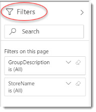
There are various filters on the right-hand sidebar that you can use to narrow down the data.
These are the Page filters. If you select the visual by clicking the report, you will see additional filter options.
Tips
- Filters which are the gold back color controls on the report allow you to pick from a list. Hold down the Ctrl key on the keyboard to select multiple items.
- If you want to search for a particular value, use the filters in the right pane menu. They will have a search box in addition to a list of the items.
- Use the Advanced option in the right menu panel for advanced search options.
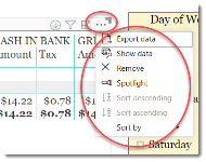
- Use the three dots […] in the top right of a visual for more options like Export data.
- Use the Help button to open the user guide for any given report
 .
.
